What's New In BETA?
We know, our platform is due for a fresh coat of paint! This brand new design will guide us in building a more consistent UI & UX going forward. We've retained major workflows from the previous design, so you can still do things the same way as before, if not faster and easier.

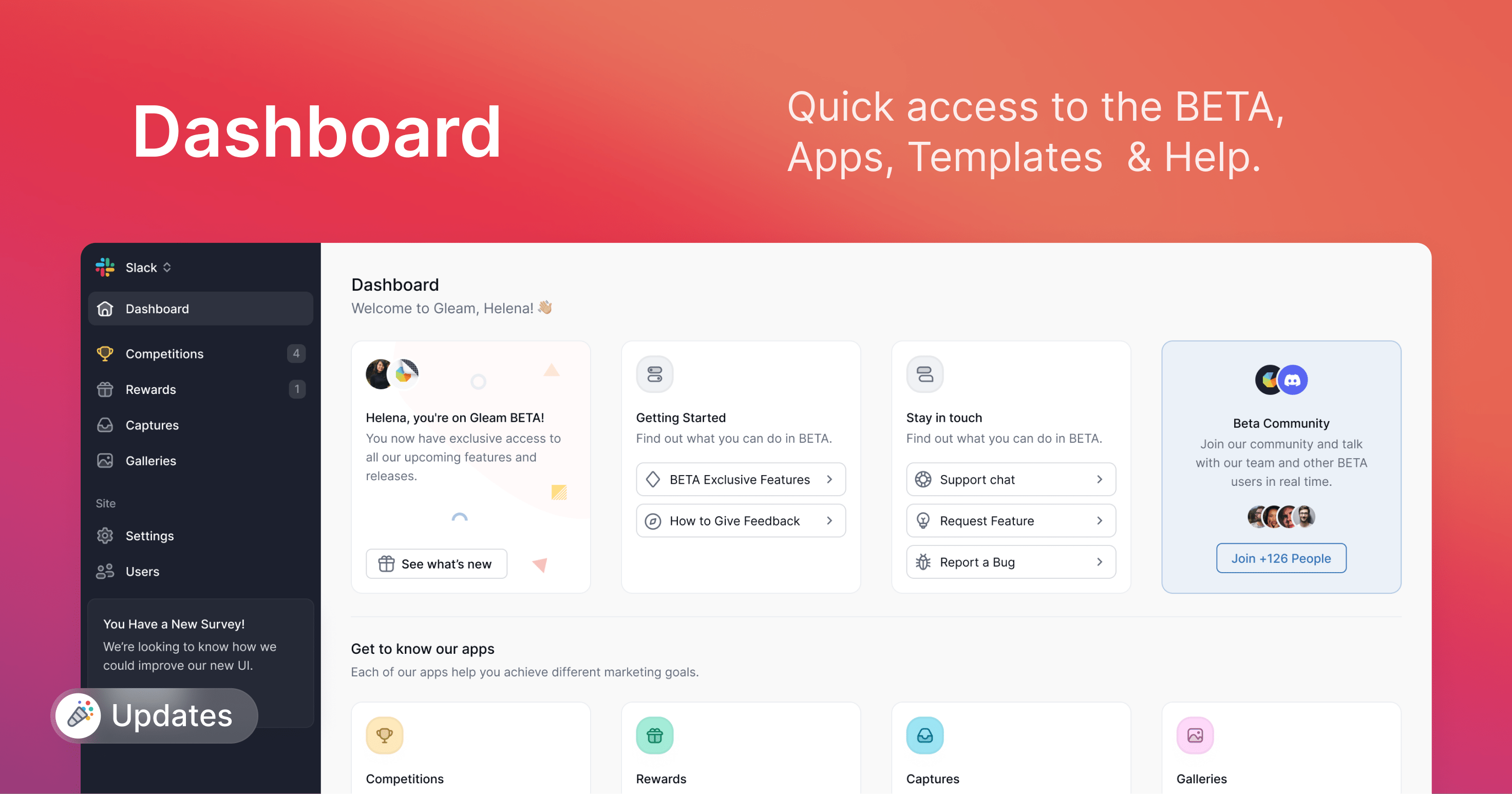
The first thing you'll notice is the brand new Dashboard. From here, you can view basic information about your campaigns, plus browse our Templates & Guides sections to explore more ways to use Gleam.

The freshly redesigned sidebar brings you some new navigation options:
- Dashboard: A new consolidated page to access all the Gleam apps and learn more about the platform.
- BETA Feedback: Bring up the Request a Feature or Report a Bug window.
A friendly widget has been added to the bottom right corner of your screen. This is a quick way for you to reach out to us if you have any queries or requests.


When creating a new Competition, you'll notice that widget customisation options have been moved into a new Design tab.
Check out your widget's look & feel on the new preview pane we've added to the screen, plus set up your landing page styles before you publish your campaign. No more going back and forth, yay!

Last but not least, you'll find all new Modern and Dark styles for the Competitions widget!
The new design features rounded edges and revised spacing & hierarchy while retaining the colourful & playful appearance of the iconic Gleam widget.
And with a choice of light & dark styles, we think the refreshed Competitions widget will look good installed on any modern webpage.
We hope you enjoy the new look, and don't hesitate to let us know what you liked about this update!
See Next Article
Welcome Aboard Gleam BETA!
With your help, we're going to build the next generation of Gleam to help you connect with your leads & customers more effectively. Thank you for joining us in this exciting new chapter.